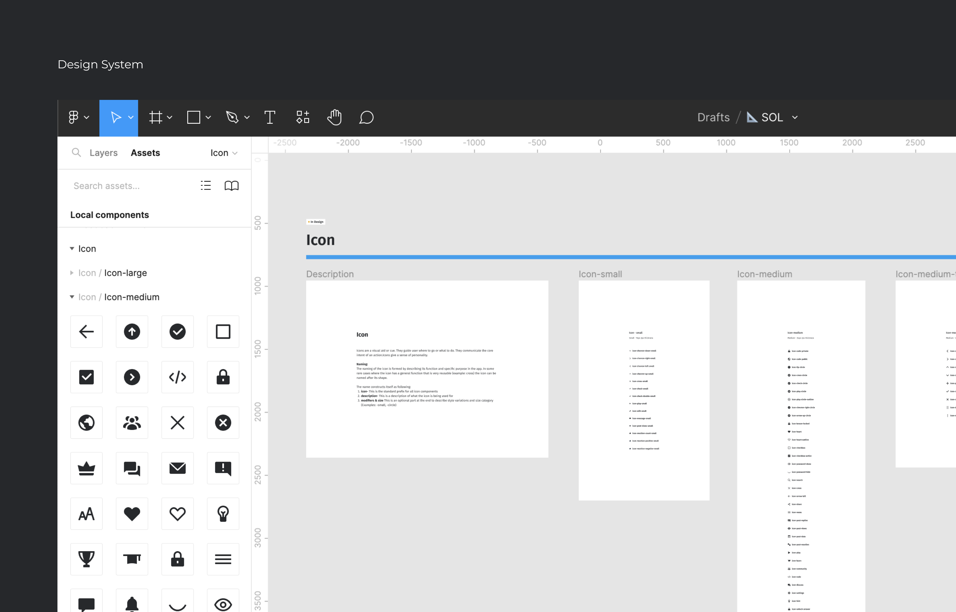
Design System
A design guidelines, principles, and
assets that define the visual and functional
aspects of a product.
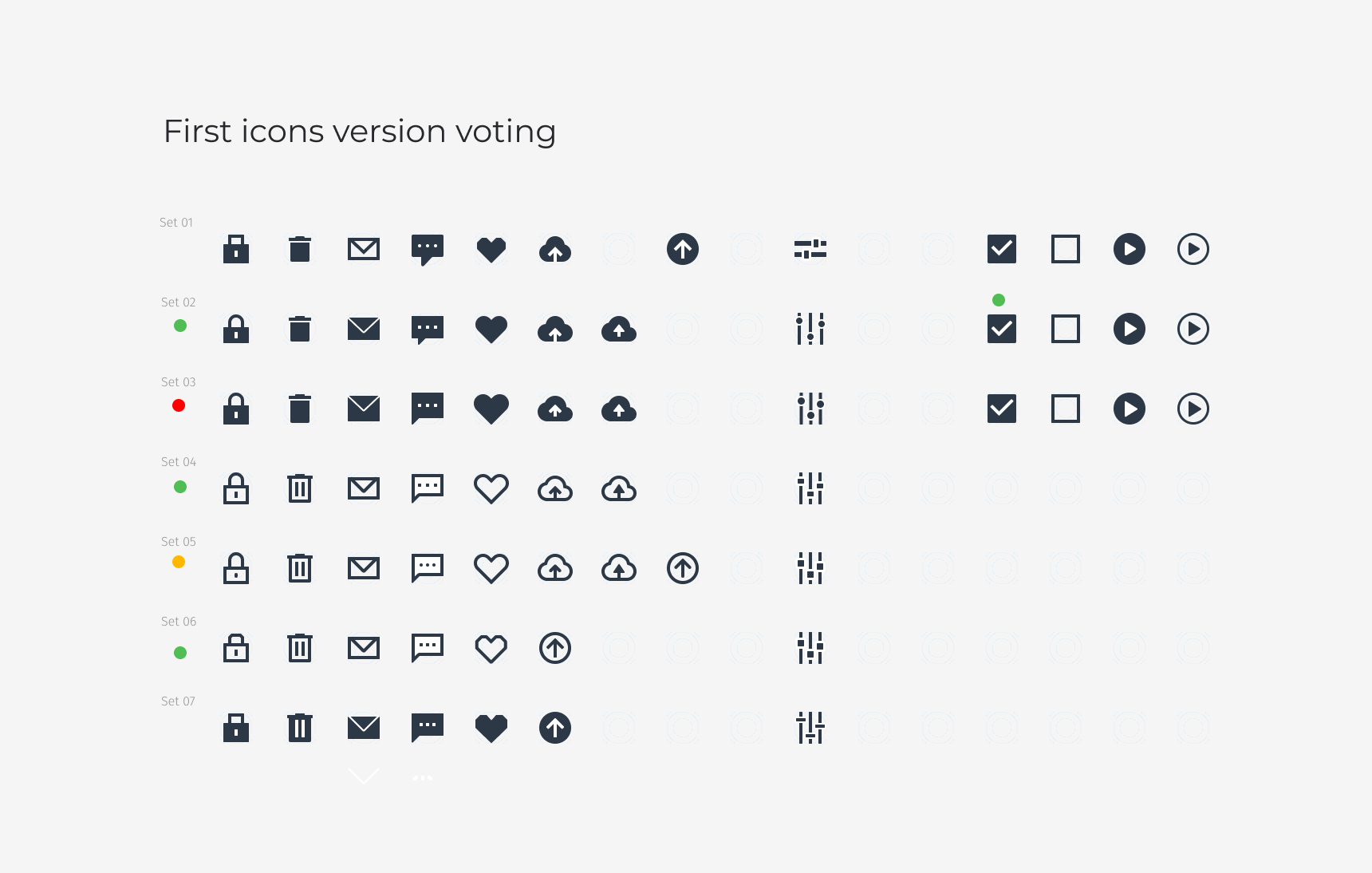
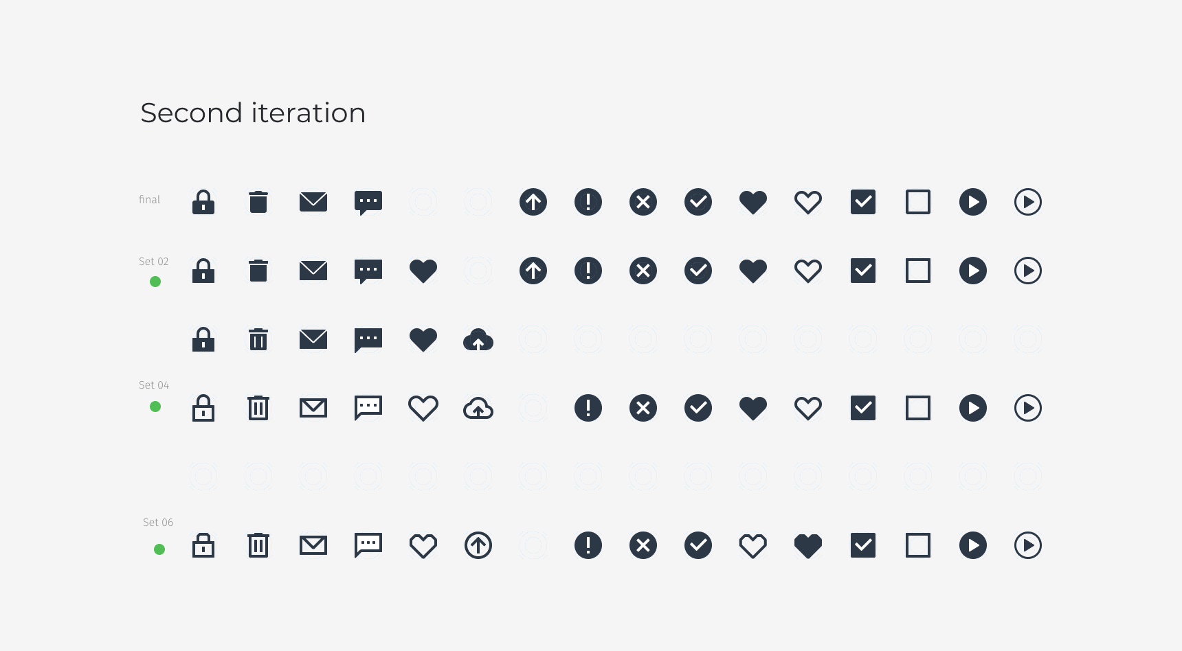
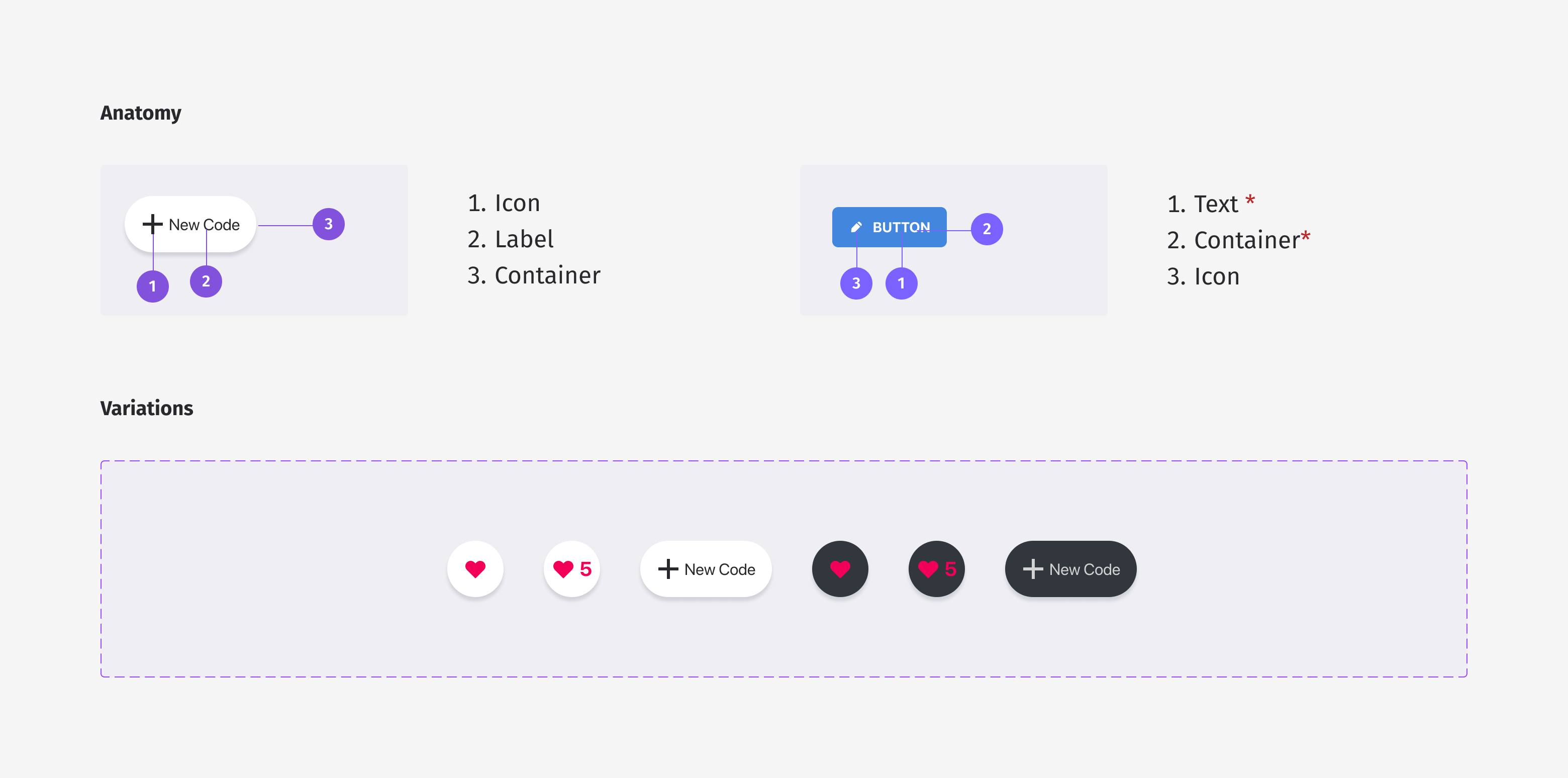
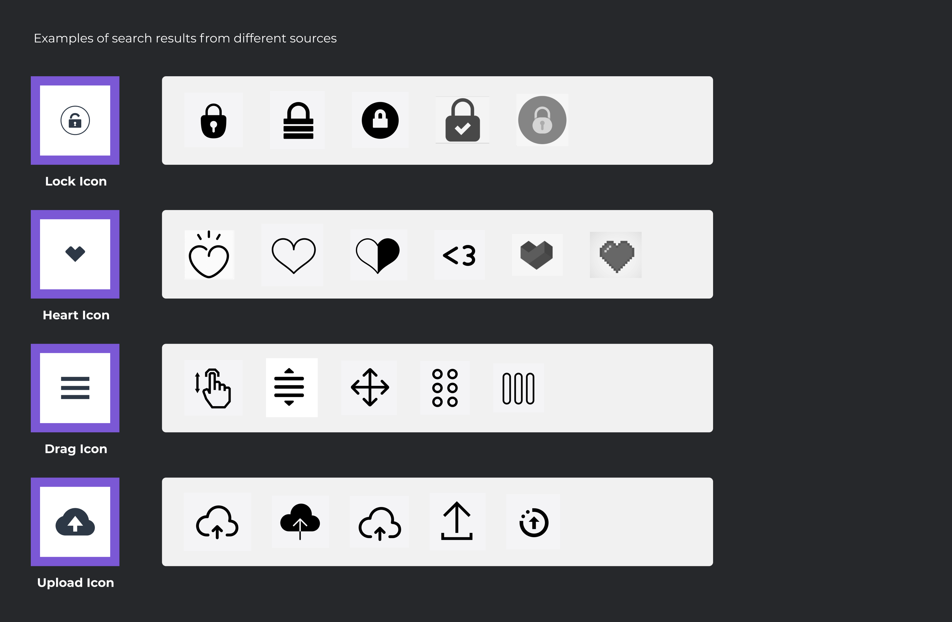
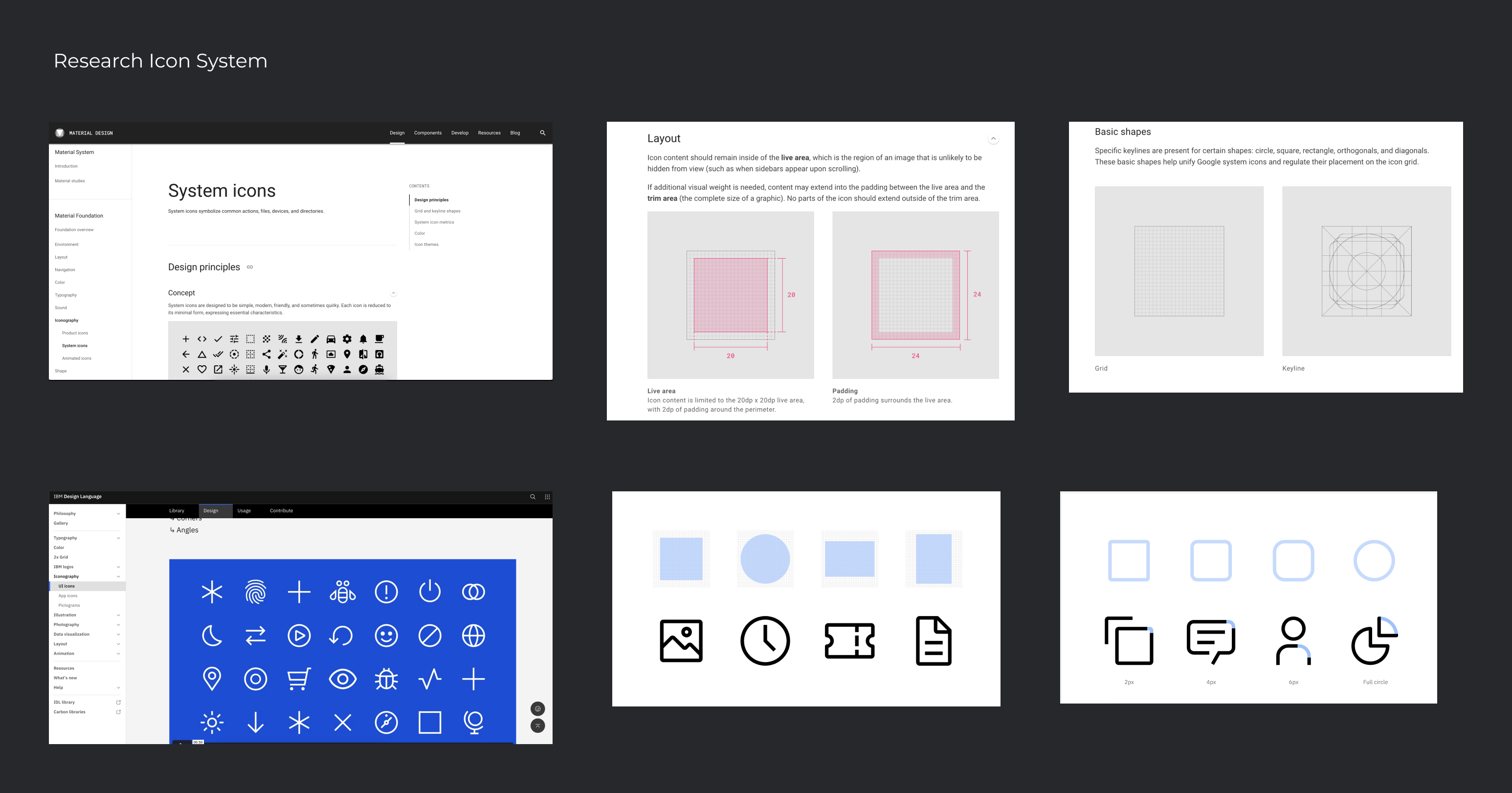
Establishing a set of rules and principles for the future use of icons in the interface was crucial to ensure consistency in design and to maintain a cohesive user experience. This involved creating a style guide, which outlined specifications for the use of icons in the interface, including size, color, and spacing. The style guide also established principles for the use of icons to ensure that they were clear, understandable, and consistent throughout the interface. By creating a new icon set and establishing guidelines for the future use of icons in the interface, the project was able to improve the user experience and provide a more consistent and cohesive interface design.
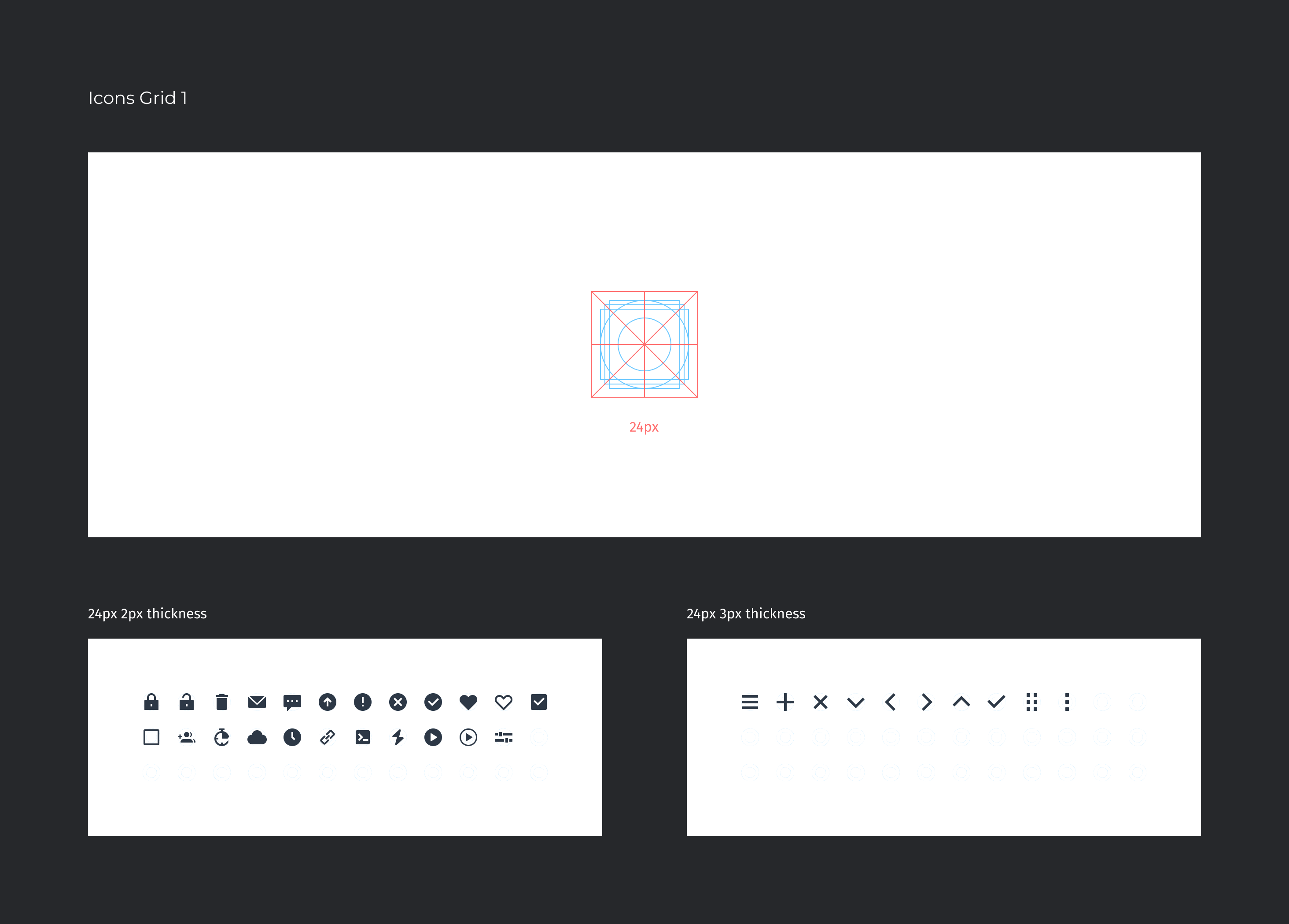
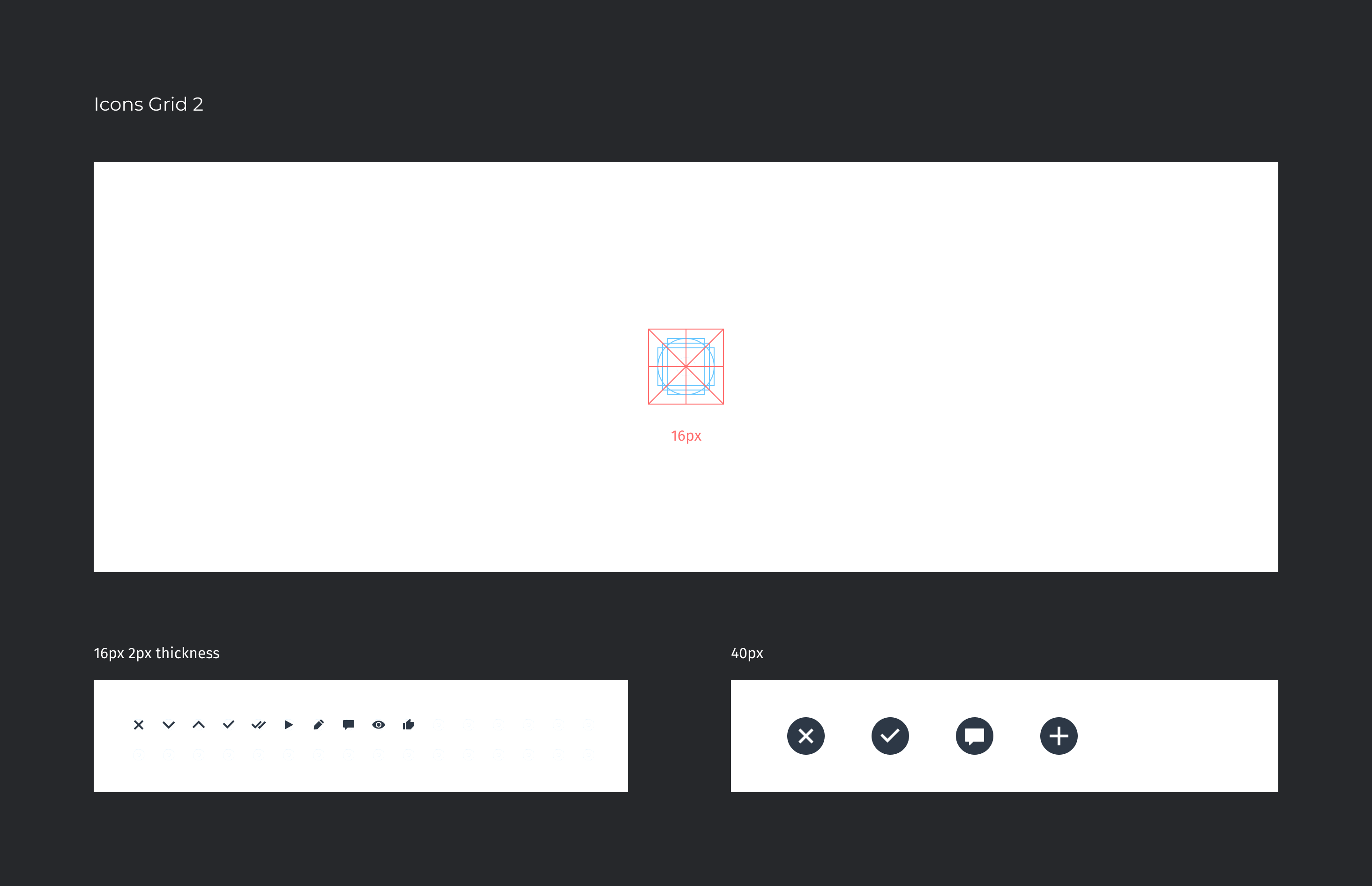
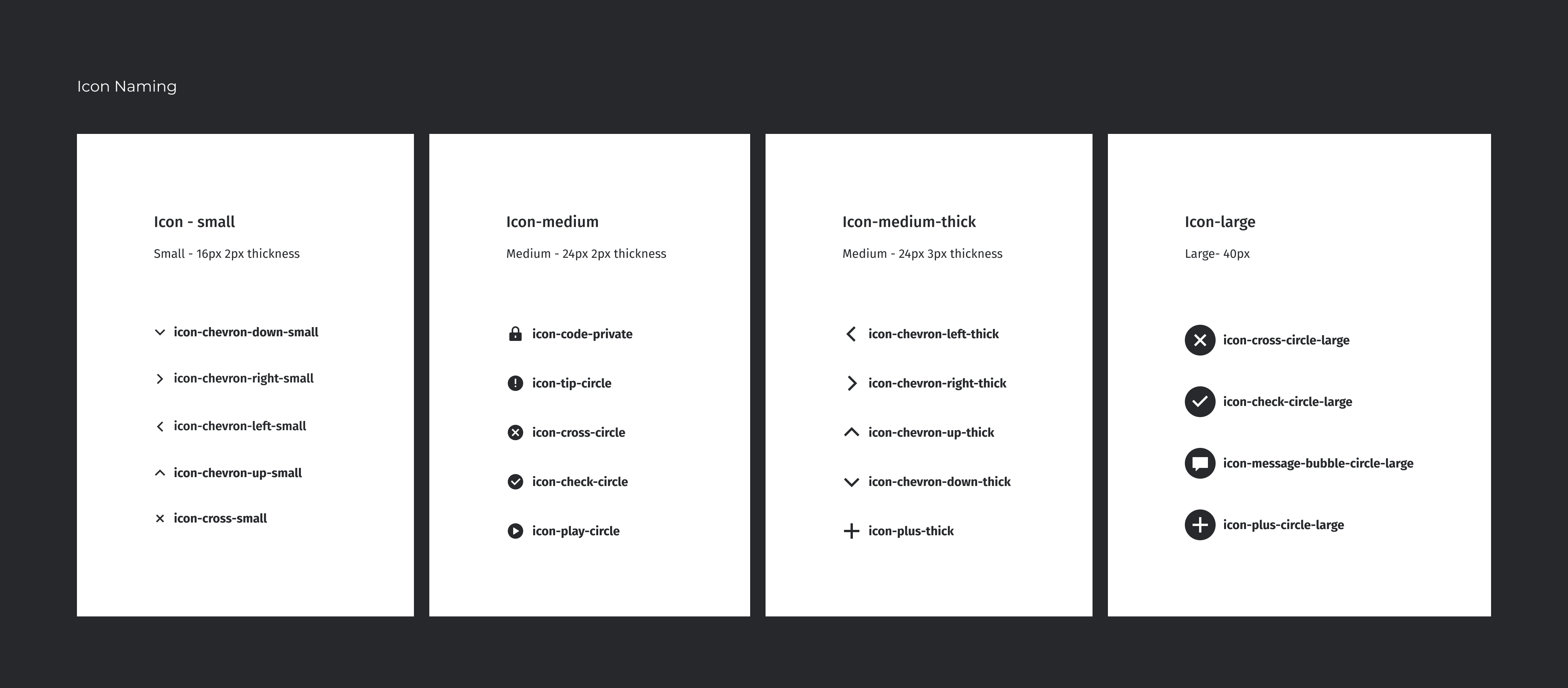
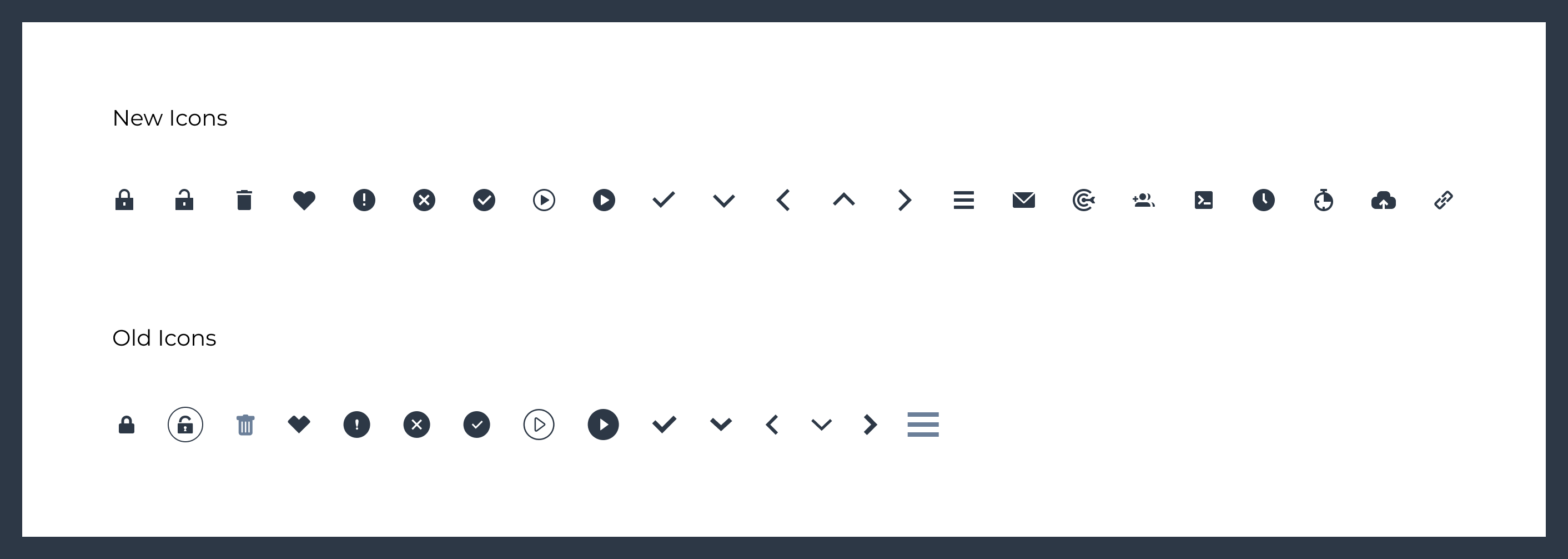
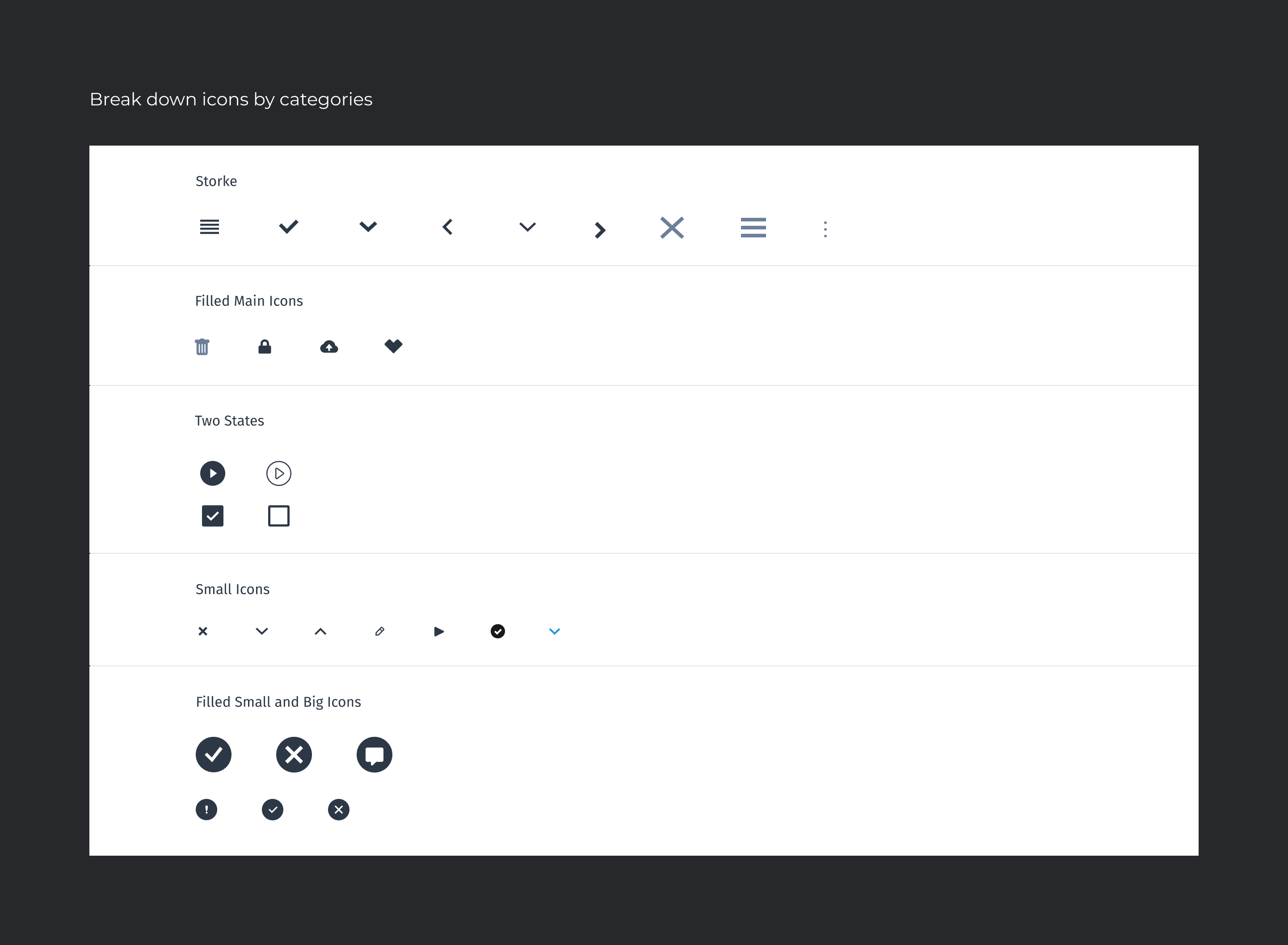
Created a new set of icons for an application with two different grid sizes, 16 pixels and 24 pixels, both contained within a 40 pixel bounding box. The main icons are filled shapes with a 2 pixel thickness, but navigation icons are outlined with a 3 pixel thickness for visibility.
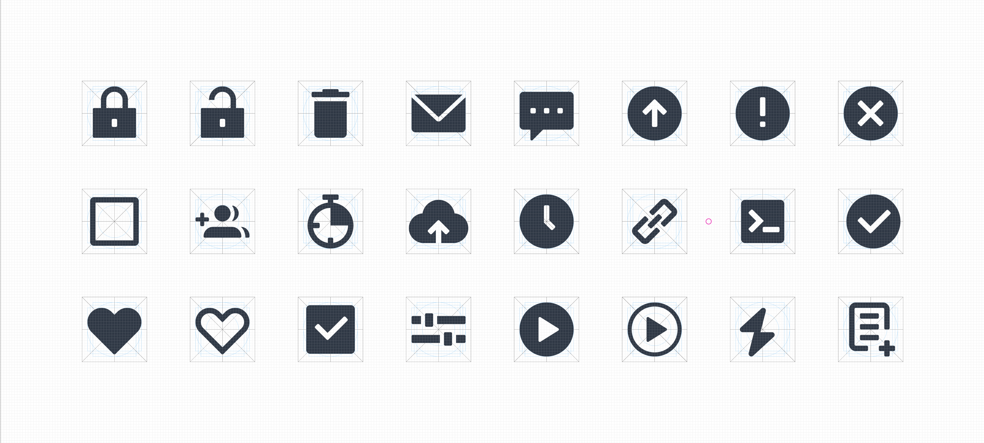
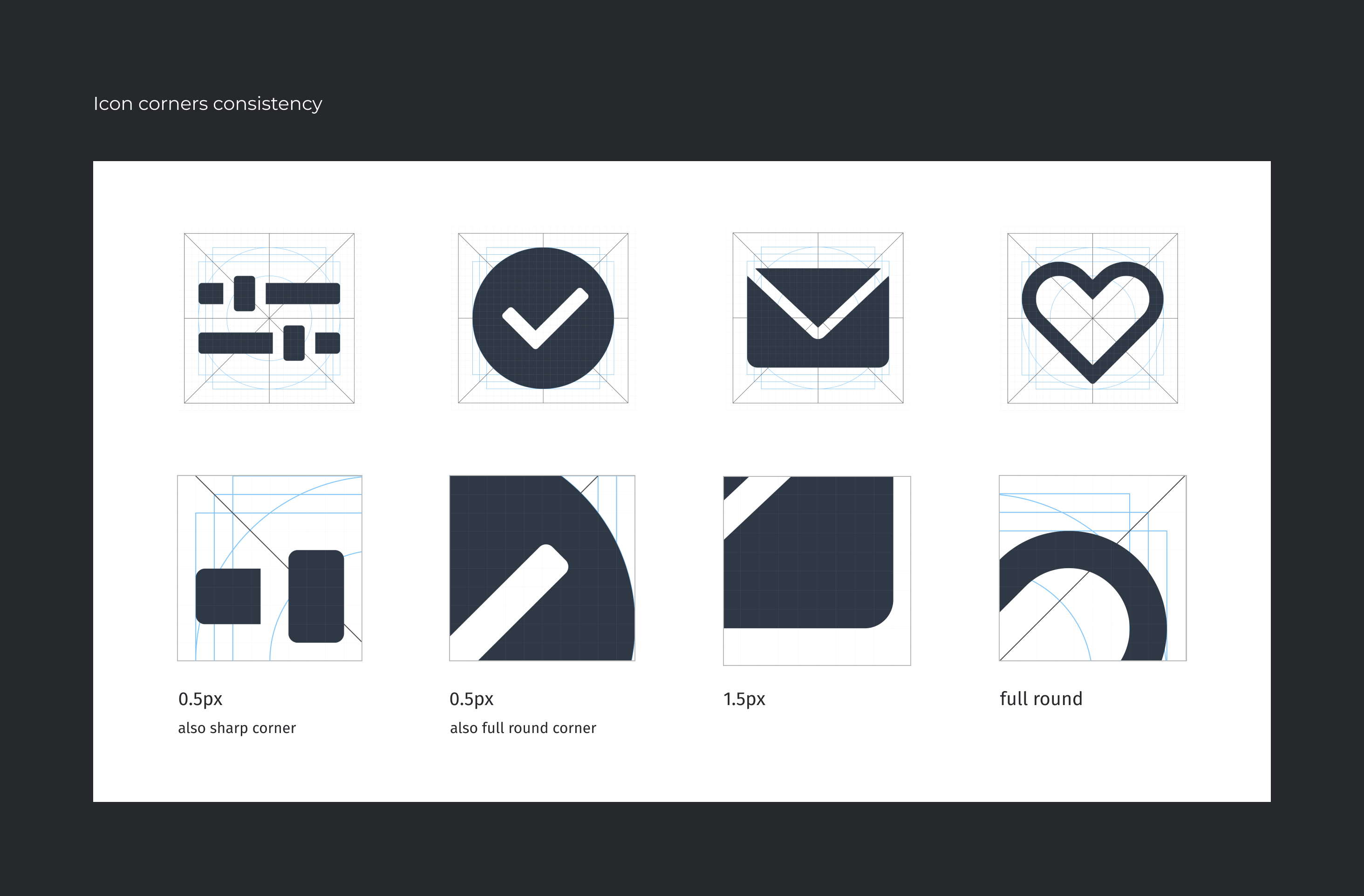
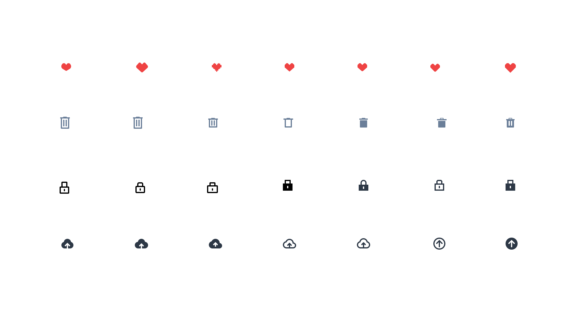
Also made a decision to keep the corners of the icons sharp yet soft, with a radius of 0.5 and 1.5 pixels. Additionally, some icons require backgrounds, but still maintain the 40 pixel size. The roundness of the icons is small but not too soft, striking a balance between sharp and rounded edges.Created a new group of icons to replace the old ones, ensuring that they are clear, easy to understand, and consistent in design.
