Beautify Tool Icon Set

UI Design
Project Overview
The task was to create a new icon package for the new feature named Beautify in PicsArt, a photo and video editor. The new feature was intended to be a face correction tool, which means it would help users to make their faces look more beautiful in the photos they edit.
My Contributions
As the Beautify feature is a part of a larger set of editing tools, I also need to ensure that the new icons fit well with the overall design of the main page and the other editing tools. It may be helpful to consider factors such as color, shape, and size when designing the new icons.

Overall, the goal was to create a set of icons that are visually appealing, easy to understand, and consistent with the existing design of PicsArt. This would help ensure that users can easily find and use the new face correction tool and other editing tools within the app.
Research
Competitor research
Through competitive research, I analyzed the icons used in various face editing applications, paying close attention to their shapes, colors, and design elements. I identified the visual symbols that were easiest for users to understand and tried to maintain consistency in my own design to make the Beautify feature in PicsArt more intuitive for users.

While the research showed that many successful products use similar shapes and designs for their icons, I also explored opportunities to create new and unique symbols that could differentiate the Beautify feature from its competitors. These new tools require further research and user testing to ensure their effectiveness and usability.

Overall, this research was instrumental in guiding the design of the Beautify feature in PicsArt. It allowed me to create icons that are visually appealing, easy to understand, and consistent with the overall design of the app. The result is a user-friendly and innovative experience for users.
Design Process
Sketching
User Testing
Iterations
Solution

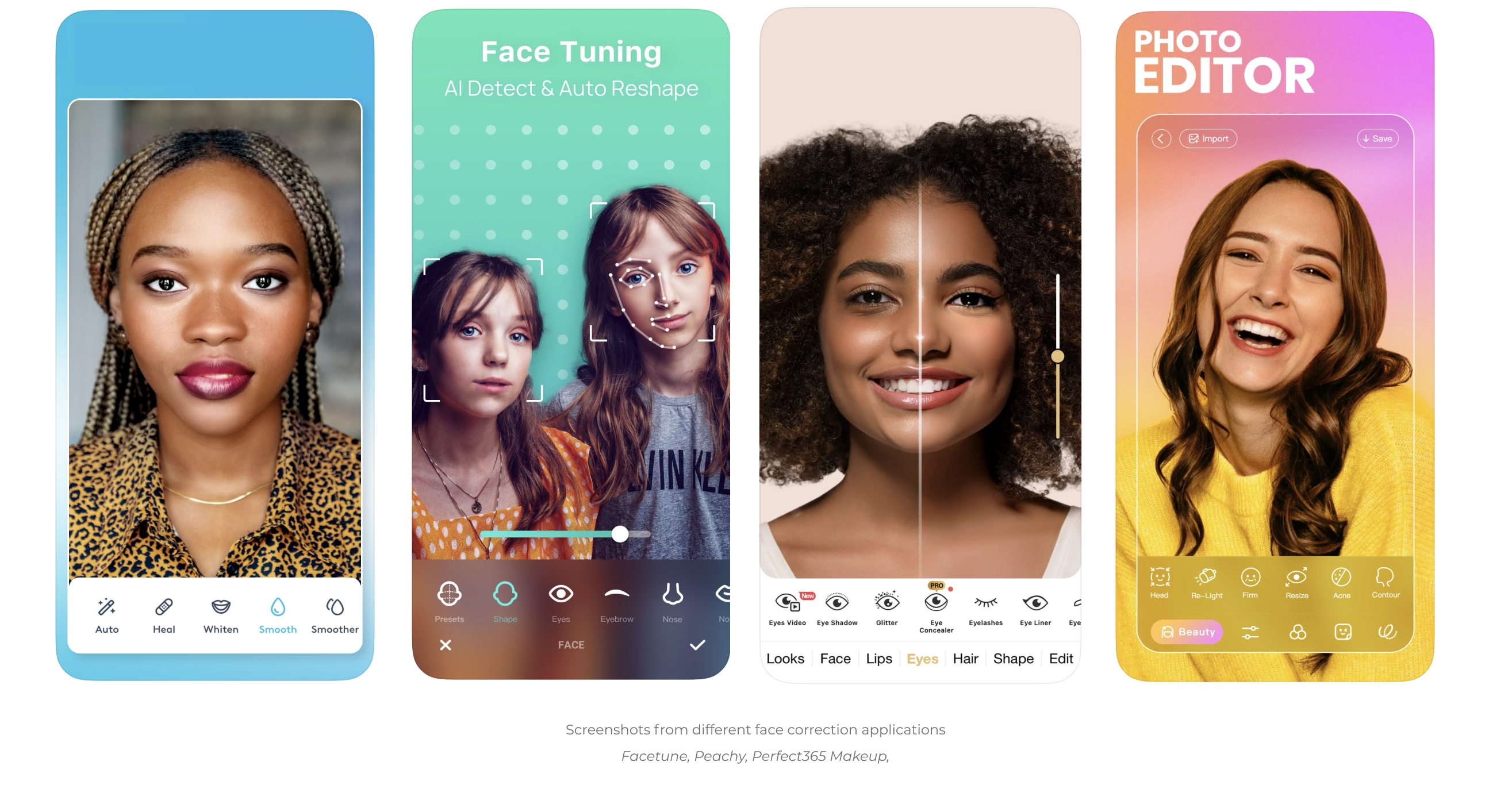
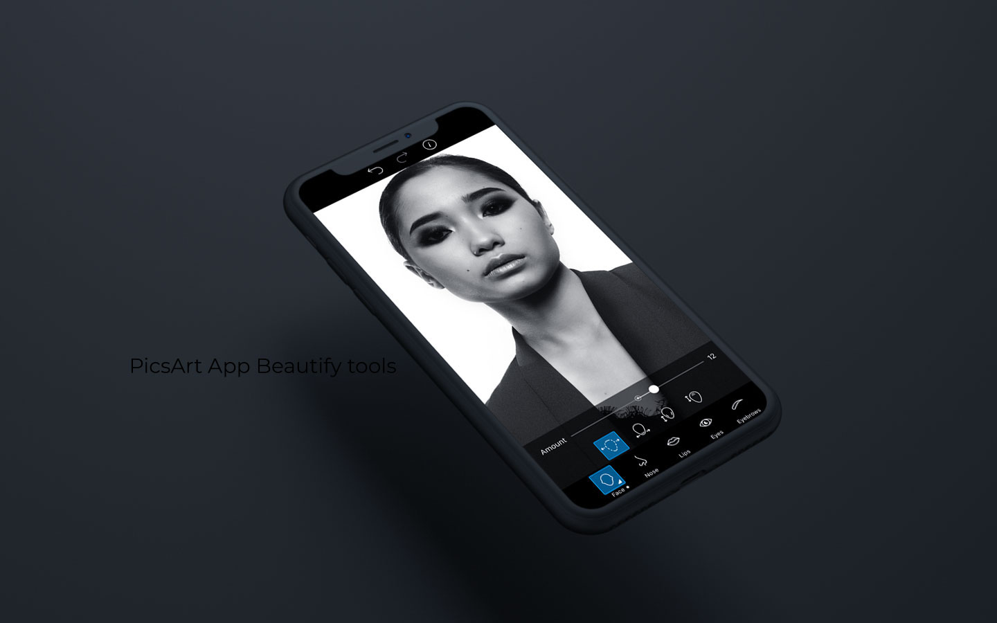
In developing solutions for the Beautify feature in PicsArt, I engaged in a collaborative process with the design team and product managers. To begin, I engaged in an exploratory phase of sketching and brainstorming, generating a range of potential designs for each descriptive tool.

Next, I worked to refine these designs through a series of iterative tests, leveraging quantitative research methods to test the effectiveness and appeal of various design options with PicsArt users. Incorporating user feedback, I made adjustments to the designs, testing them multiple times to ensure optimal usability and user satisfaction.

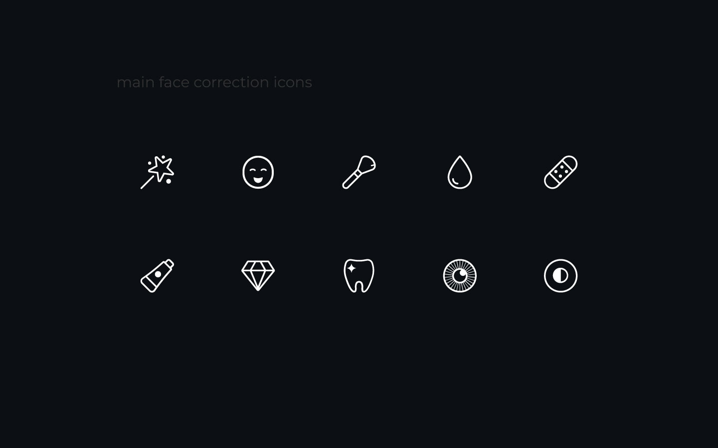
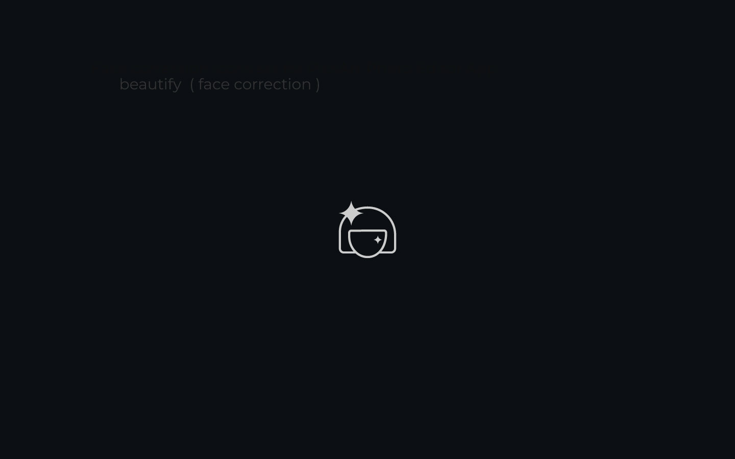
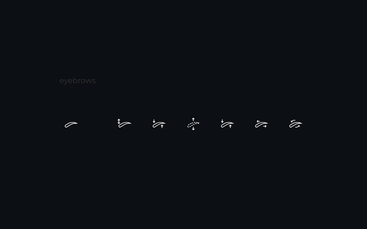
Beyond the functional elements of the icon designs, I also placed a high emphasis on the stylistic considerations, focusing on the aesthetics of each icon. Specifically, I sought to create designs that were visually appealing, with fewer lines and smooth, round corners that lent a sense of approachability and charm.

Overall, through this highly collaborative and iterative process, I was able to develop a suite of icon designs that were both highly functional and aesthetically pleasing, elevating the overall user experience of the Beautify feature in PicsArt.